Est. reading time: 4 minutes
A great dashboard feels like stepping into a sunny room where everything you need is within arm’s reach; a confusing one feels like rummaging through a dim attic. The difference isn’t magic—it’s intention. Let’s explore how clear signals, flowing metrics, and delightful design turn data into decisions, while clutter and chaos do the opposite.
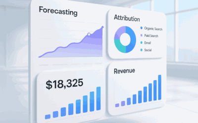
Clear Signals, Happy Users: Dashboards That Shine
A shining dashboard starts with a single, sharp purpose. It foregrounds the core question—“Are we on track?”—and puts the most important KPI right where the eye lands first. Everything else supports that story, not competes with it.
Good dashboards use hierarchy like runway lights: bold, legible headlines; clear time ranges; direct labels on charts instead of legend scavenger hunts. Color carries meaning, not decoration—greens and reds for status, neutrals for context, and a consistent palette users can trust.
Whitespace is treated as a feature, not a waste. It separates thoughts, reduces cognitive load, and guides attention without shouting. With this quiet confidence, users understand the layout in seconds and navigate with a smile.
When Metrics Flow, Decisions Feel Like a Breeze
When metrics flow, they lead somewhere. A tidy sequence—top-level outcome, leading indicators, operational levers—creates a narrative arc that answers “what, so what, now what?” The user’s path from overview to drill-down feels like stepping stones across a stream.
Benchmarks, targets, and variance are shown side-by-side so movement instantly translates into meaning. Sparklines reveal trend at a glance; annotations explain why a spike happened; thresholds make exceptions pop. The result: decisions that feel obvious rather than onerous.
Microcopy does quiet heavy lifting: “compared to last week,” “target: 3.2%,” “updated 5 minutes ago.” Clear time granularity and refresh indicators build trust. And when action is needed, the dashboard offers it—filters, links to tickets, or a one-click deep dive—so momentum never breaks.
Cluttered Charts and Chaos: The Confusion Trap
Confusing dashboards try to impress instead of inform. Rainbow palettes, 3D bars, dual y-axes, and pie charts with a buffet of slices create visual noise that buries the signal. Users squint, guess, and eventually give up.
Inconsistent definitions and time windows turn teams into amateur detectives. When “Active Users” means one thing in one widget and another elsewhere, alignment frays. Stale data and cryptic legends push trust off a cliff—and screenshots with red circles start flying in chat threads.
Overstuffed grids and micro-widgets promise completeness but deliver fatigue. Too many filters without sensible defaults, tables that sprawl past the horizon, and metrics with no context create a maze. The final blow: slow loads and spinning spinners that train people to stop checking at all.
Design for Delight: Make Insight the Fastest Path
Delight comes from empathy and restraint. Start with the job to be done: which decision should this screen accelerate? Give people the best default view, then offer progressive disclosure for curiosity and edge cases.
Use direct labeling, color with purpose, and small, thoughtful touches: tooltips with definitions, hover comparisons, and in-line “why” notes for anomalies. Keep motion subtle and purposeful; make empty states helpful, showing how to populate or fix missing data.
Design for performance and accessibility: responsive layouts, keyboard-friendly navigation, and colorblind-safe palettes. Personalize by role so each viewer sees what matters to them. When insight is the shortest path—and the path feels smooth—people keep coming back.
Clear dashboards respect time, attention, and intent; confusing ones drain all three. By prioritizing purpose, hierarchy, context, and performance, you turn data into a confident companion instead of a cryptic oracle. Build for delight, and your dashboard won’t just be used—it’ll be loved.