Est. reading time: 3 minutes
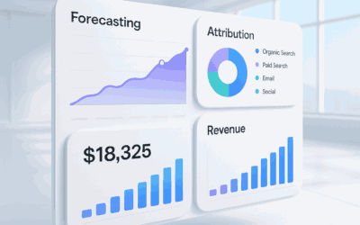
Dashboards turn the daily data deluge into a bright, navigable landscape. Instead of scrolling through endless rows and columns, you get a living picture—one that nudges your attention toward what matters most. Cheerfully clear, delightfully visual, and instantly useful: that’s the dashboard difference.
From Raw Rows to Revelations: Dashboards Delight
Raw exports are honest but shy; they tell the truth, just not very loudly. A visual dashboard puts a megaphone to that truth, transforming scattered figures into patterns, priorities, and possibilities. The result feels less like accounting and more like discovery.
Dashboards organize data into visual narratives. Metrics become moments in a story, with chapters you can navigate at a glance—acquisition, engagement, revenue, retention. The storyline is coherent: you see where you’ve come from, where you stand, and where to look next.
Most importantly, dashboards compress the time from question to clarity. Instead of wrangling pivot tables and VLOOKUPs, you absorb shape, direction, and scale within seconds. That regained time becomes strategic: more experimenting, more iterating, more winning.
See Trends at a Glance, Not in a Maze of CSVs
Trends hide in plain sight within CSVs—if you can find them. Visuals make them leap out: a rising line, a sudden dip, a seasonal swell. Your brain recognizes the pattern before your eyes finish the sentence.
Dashboards also layer context. You don’t just see one metric trending; you see how it moves alongside others—conversion with traffic, churn with support volume, NPS with feature releases. The juxtaposition reveals relationships you’d miss in isolated spreadsheets.
And when freshness matters, dashboards keep rhythm with live data. A sparkline shows today’s pulse; a heatmap highlights hotspots; thresholds flag when something needs action. The signal is unmistakable, and the noise stays in the background.
Interactive Insights Beat Static Exports, Yay!
Static exports freeze moments; dashboards invite movement. Filter by segment, drill into a spike, hover for details, adjust the date range, compare cohorts. Interactivity turns “What happened?” into “Why?” and “What if?”
Governed metrics and definitions reduce the “whose spreadsheet is right?” debate. A dashboard encodes the rules—calculations, time zones, attribution logic—so everyone plays the same game on the same field. Consistency builds trust, and trust accelerates decisions.
Interactivity also means you can explore without breaking anything. Save a view, test a scenario, annotate a chart, revert when you’re done. Curiosity becomes safe and scalable, unlocking insights at the edges of the organization—not just in the analyst’s inbox.
Dashboards are shareable by design. Send a link, set permissions, and everyone sees the same, current truth—no version spaghetti, no sprawling attachments. On mobile or in a meeting room, the view is crisp and ready.
Collaboration thrives when context travels with the chart. Comment threads, annotations tied to timestamps, and saved snapshots recreate the “why” behind the “what.” Decisions become traceable, and wins become teachable.
Finally, dashboards democratize insight. New teammates can onboard faster, stakeholders stay informed without analyst mediation, and leadership can steer with confidence. Clarity scales, and so does celebration—because progress is easier to cheer when it’s visible.
Raw exports will always have a place, but dashboards give data its voice, its color, and its momentum. They turn numbers into narratives, clicks into curiosity, and curiosity into action. Choose the view that helps everyone see—and succeed—together.