— Web Development
Most websites leak revenue.
We build the ones that don’t.
Most sites are built to look good and stop there. We build them to look good and convert. Every page, every section, every button earns its place or it doesn’t ship.
Get Your Free Website Audit

Your Website Matters
It’s not just a homepage and a nav bar.
It’s where people decide if they trust you, if they understand what you do, and if you’re worth their time.
Every ad, email, and search click lands here. If your site isn’t fast, clear, or easy to use, you’re wasting money sending traffic into a dead end.
The audit is where we start. We’ll show you what’s broken, what we’d rebuild, and what it would look like to do it right.
What We Build
We don’t hand you a template with your logo dropped in. Every site is built around your business, your buyers, and what needs to happen when someone lands on the page.
Designed around the sales motion
We map the site to how your buyers actually decide.
Every page has a job, every section has a reason to be there, and every CTA is placed where the reader is ready for it, not where a template says it should go.
A backend you can actually use
Your dashboard shouldn’t feel like a hostage situation.
We name things like humans, organize things like neat freaks, and hand you a site you can update without emailing a developer every time a headline needs to change.
Marketing stack wired in during the build
CRM, email platform, Meta Pixel, GA4, Zapier, cookie notices, conversion tracking.
Whatever your stack needs, we wire it in during the build. No duct tape after launch. No “we’ll figure out tracking later” and then never figuring it out.
SEO-Ready. Google Approved.
We add in structured data and clean code so Google understands your site.
No shady tricks here.
Future-Proof & Plug-and-Play
Need it to talk to your CRM, email, or Slack? Easy.
We build with tools like Zapier in mind, so you’re ready to grow without breaking things.
Training that actually sticks
You get a custom walkthrough video and real documentation so your team can run the site without guessing.
Plus 30 days of post-launch support, because things always come up in the first month.


Made With You.
Not For You.
The scariest part of hiring someone to build your site is getting back something that looks nothing like your brand and being told it’s too late to change.
We don’t disappear for six weeks and drop a finished site in your inbox with a subject line that says “good luck.” You see the build as it takes shape. You give feedback while things are still easy to change. Nothing goes live that you haven’t already signed off on.
What launches looks like you and works for a living.
Future-Proof by Design.
Your website shouldn’t box you in.
It should open doors.
Most sites look great at launch and start fighting you a year in. A new product line needs a custom template. A new integration breaks the checkout. A simple copy change requires a developer and a two-week timeline. What started as an asset turns into a bottleneck.
We build the opposite way. Clean code your next developer won’t curse us for. Modular components your team can update without opening a ticket. Integrations structured so adding the next tool doesn’t break the last three.
The goal is a site that’s still working for you in year three, not one waiting to be rebuilt.


SF
SF
SF
SF
SF
SF
SF
SF
SF
SF
SF
Their Words,
Not Ours
Here’s what our clients have said about working with us.
“Nick and the team at Tailored Edge helped us with everything — redesigning our website, getting our Facebook and LinkedIn ads up and running, managing all the content, keeping the promotions moving. I really appreciated how hard they worked and how easy they made it for us to understand what needed to happen. We got where we needed to go because of their help.”

“I can’t imagine my business without Tailored Edge Marketing, and I still wonder what I was doing all those years before they became part of my team! They took us to the next level after being stuck at a standstill for several years. With all their hard work, input, and feedback, I finally feel like my business is reliable and stable again. We now have targeted leads coming into our business every day, getting to know what we offer, and converting into paying clients. Thank you, Nick!”

“Nick and Tailored Edge did a great job helping us launch our new bike lines. They didn’t just bring us traffic — they helped us actually sell bikes, and not cheap ones either. Nick understood what we needed, made smart tweaks along the way, and got us real results.”

“The automations and systems Nick set up for my business have been a total game-changer. My customer acquisition and retention have grown like crazy since I started working with him and his team. It’s saved me so much time, and the headache of trying to do everything manually. Now I get to stay focused on what I’m good at, and Tailored Edge keeps everything running smooth behind the scenes.”

“It’s so hard to find a good digital ads guru. Everyone says they’re great at it, and very few that I’ve hired end up doing much. Nick is different. From day one, he took charge, optimized what we were doing, and sales started coming in. He also provided valuable feedback on changes we should make to our creatives for better conversion.”

Heard This One Before?
We’ve seen the messes. We’ve cleaned them up.
If your last project went sideways, we’re the team that gets it back on track with a clear plan, real updates, and a site that works the way it should.
"The freelancer ghosted us."
—
"It kind of works on mobile... you just have to tilt your phone sideways."
—
"My nephew built it. Can you fix it?"
What You Get
From strategy to post-launch, we’ve got every piece covered.
Strategy & Planning
– Discovery call
– Site architecture mapped out
– SEO-friendly URLs and flow
Design & Build
– Mobile-first responsive design
– Organized backend
– Custom branding: fonts & colors
Integrations
– CRM, email, analytics tools
– Meta Pixel, GA4, cookie notices
– Zapier/Make automation ready
Optimization
– Core Web Vitals tuned up
– Image compression
– SEO-friendly
– Contact forms that actually work
Training & Handoff
– Custom video walkthrough
– SOPs for updates
– 30-day post-launch support
100% Satisfaction
– Clear communication
– Aligned with your goals and style
– We don’t wrap until you’re thrilled
Our Process
Audit & Design Prep
Before we touch a pixel, we audit your existing content, clarify the site flow, and prep initial mockups that reflect your brand and your buyer's journey. You see the direction before we start building.
Build
Now we build the real thing in WordPress, with all the marketing tools wired in: tracking, forms, CRM, analytics, and whatever else your stack needs to run smooth.
Test
We test for mobile, speed, SEO, accessibility, and functionality across browsers and devices. No broken buttons, no mystery errors, no "it works on my machine."
Launch
Go live without the chaos. We handle the technical migration, train your team with a custom walkthrough video, and make sure you know how to manage your site without needing to Google it.
Ongoing Support
Need content updates, quarterly check-ins, or ongoing maintenance? We've got you. Hands-on support when you want it, peace of mind when you don't.
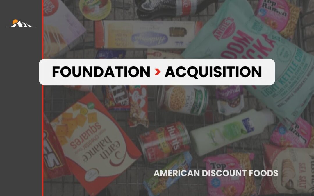
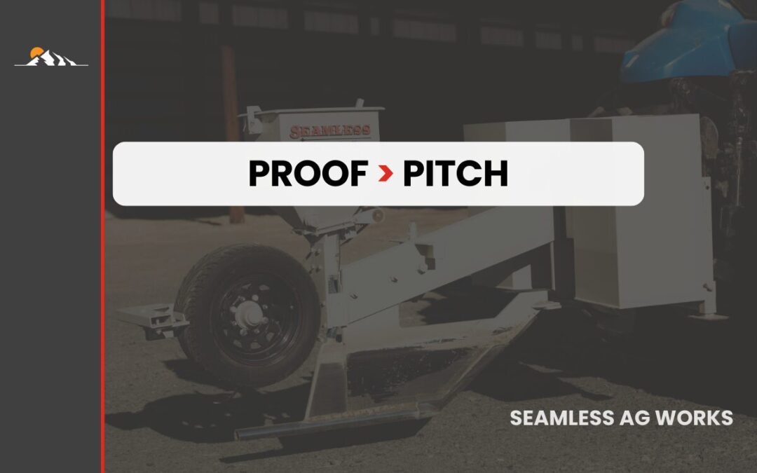
Real Clients,
Real Results.
What happened. Why it worked.


Ask These Questions
—No Matter Who You Hire
A good website starts with straight answers. These are the questions we’d ask before hiring anyone to build ours.
Who owns the site when it’s done?
You do. Period. We don’t hold your site hostage and there are no strings attached. Once it’s launched, you have full access to the backend, logins, and files. Your site, your brand, your asset.
Will my site be fast? Like actually?
Yes. Speed isn’t just a bragging point—it’s survival. A slow site costs you leads and sales. We build with Core Web Vitals in mind, which means your site loads quickly, runs smoothly on mobile, and keeps people from bouncing.
What if I don’t love the design?
You see the design before we build it, and you have real input throughout the process. We build collaboratively, so by the time we’re in development, the design already feels like yours. If something’s off, we adjust. We don’t wrap until you’re genuinely happy.
Will my site show up on Google?
We set up the foundation that gives you a fighting chance: clean site structure, SEO-friendly URLs, schema markup, and proper meta tags. No magic tricks, no false promises—just the right groundwork so Google knows you exist.
How much does a website cost?
It depends on scope. A five-page service site is a different project than a 50-page ecommerce build. We give you a clear, honest quote after we understand what you need. No surprise invoices, no scope creep without a conversation first.
Do I need to provide all the content?
Not necessarily. If you have content ready, great. If you don’t, we’ll help with copywriting and content strategy so you’re not staring at a blank page. Either way, we’ll guide you on what’s needed so nothing holds up the build.
What if I need marketing help after the site is done?
That’s how most of our client relationships start. The site is the foundation, then we layer on paid ads, email, or SEO depending on where the biggest opportunity is. You don’t have to use us for marketing, but the site will be built to support it if you do.
What happens if something breaks after launch?
You get 30 days of post-launch support included. If something breaks, we fix it. After that, we offer ongoing maintenance if you want it, or we hand you a site clean enough to run without us. Either way, you won’t be left hanging.


We’re Not Here to Sell You a Website
We’re here to build one that actually powers your business.